Accelerating Efficiency With Block’s First Documentation Site
The Block Design System supports numerous teams at H&R Block, but lacks clear documentation and guidance. To enhance efficiency, quality, consistency, and collaboration within design and development teams, we launched a new documentation website.
Overview
Where I led
End-to-end design, User research, Information Architecture, Wireframing, Visual Design, Content, User testing, Development hand-off
Team
Lead Design Systems Engineer, Sr. Engineer, Lead Product Designer, Product Designer (Me)
Duration
Nov 2023 - July 2024
Problem
Design and development inconsistencies led to inefficiencies and team frustrations.
With several design system iterations and rebrands in the past, H&R Block found itself with a messy system absent of documentation. This resulted in mismatched design/dev components and disparate usage guidelines, leading to inconsistent experiences and frustrated teams.

DESIGN PROCESS
Discovery
Personas, goals, and scope were established to lay the project’s foundation.
For our phase 1 launch, we identified four key user groups crucial to our documentation site based on our current design system’s users: designers, developers, project managers, and external learners.
In the absence of a dedicated product owner, each team member assumed a part of that role, necessitating clear goals and a strategic approach to project execution. Drawing insights from the 2023 Block Design System NPS survey we ran, as well as the defined personas, we formulated the following project goals:
A competitive analysis was conducted to analyze six leading documentation sites in the design system space.
Because this would be a new documentation site for H&R Block, we wanted to research industry standards and learn from the leaders in the design system documentation space.
Key Takeaways
Give users a place to start
Organize content based on priority and persona
Show & tell: give users a live demo, code to reference, theming/mode examples
Portray your brand throughout the site
Keep page layouts simple and clear
A variety of information architectures were explored to uncover the right fit for H&R Block’s documentation site.
Drawing inspiration from leading documentation sites, we explored 5 different information architectures with a variety of depth, categories, and organizational styles. After careful deliberation, we settled on a site map that we felt best served our audience and company’s unique needs, allowing for intuitive navigation and seamless user journeys.
We moved forward with site map #3
With a clear foundation in place, we needed a strategy to tackle the work incrementally and with agility.
To prioritize the work, I led the team through a prioritization workshop analyzing the impact vs. effort of each section within our information architecture. Following the prioritization of the sections, we began prioritizing the individual pages within each section. This yielded a detailed roadmap of how to tackle the work. For our MVP, we decided to focus on the home page, component overview page, and individual component pages. Feeling that these sections had the highest impact, we decided to move “Get Started”, “Styles”, “Patterns”, and “Support” pages to phase 2.

DESIGN PROCESS
Exploration
Low-fidelity wireframes highlighted a need for section templates.
To ensure the team was aligned on the main aspects of our documentation site and nothing was left unaccounted for, we created low-fidelity designs for the home page, component detail pages, pattern pages, support pages, get started pages, and style pages. As designs unfolded, the team recognized a pattern forming in our page sections. Each section required a one-page template that could then be replicated.
DESIGN PROCESS
Design
Once the page outlines were defined and approved by leadership, it was time to start modulizing and templatizing pages.
Applying the new company branding, I designed high-fidelity pages for each template. By building page templates with defined modules, composed of BDS components, our team could accelerate our speed to market through scalable templates built on the design and development side.
DESIGN PROCESS
Identifying Gaps
The UX development process helped us identify gaps within our current system and contribute solutions back to the enterprise.
Designing the documentation site led to the team identifying gaps within the design system. In doing so, we contributed new styles, components, and philosophies back to the enterprise. While designing the page templates, the team saw an opportunity to improve our current grid system, making grids more specific to their context and better aligned with code. As well, spacing had never been clearly defined at HRB or implemented correctly. With Figma’s new release of variables, I was able to define spacing increments, document them, and get them developed into CSS classes on the development side. Finally, several new components like side navigation, table of contents, simple selects, and tables were developed.
DESIGN PROCESS
User Testing
User testing was conducted to validate information architecture decisions and new component designs.
The team ran a usability test to answer two questions:
Was the IA and section naming within the documentation site intuitive to our user base?
Out of two new designs for the navigation component, which was preferred?
A combination of designers, developers, and product managers were recruited to participate in moderated A/B usability testing. Users were asked to identify what they thought belonged under each section, find their way to specific pages, and repeat the process for option B, ultimately stating their preference.
Option A
Option B
Testing results moved the team forward with clarity and direction.
Although users felt both navigation components were easy to use, option B was the preferred choice. During IA content testing, we noted that the term "foundations" was potentially confusing for some participants. Therefore, we proceeded with option B and renamed "foundations" to “styles” for clarity.
DESIGN PROCESS
Quality > Quantity
With a fast-approaching deadline and a lean team, we had to reprioritize which features would make it into our MVP and which would come later.
We decided to remove the "Angular" and "Figma" tabs from our MVP to focus on usage documentation. Instead of building these resources ourselves, we adopted a hub-and-spoke strategy, linking out to our existing tools like StoryBook and Figma, which already offer detailed documentation, code snippets, and properties for developers and designers. This approach allowed the Block Design System documentation site to serve as a starting point while still providing clarity and alignment for development and design.
Original Design
MVP Revisions
FUTURE STATE DESIGNS
Block Design System Documentation Site
FINAL DESIGN
Home Page
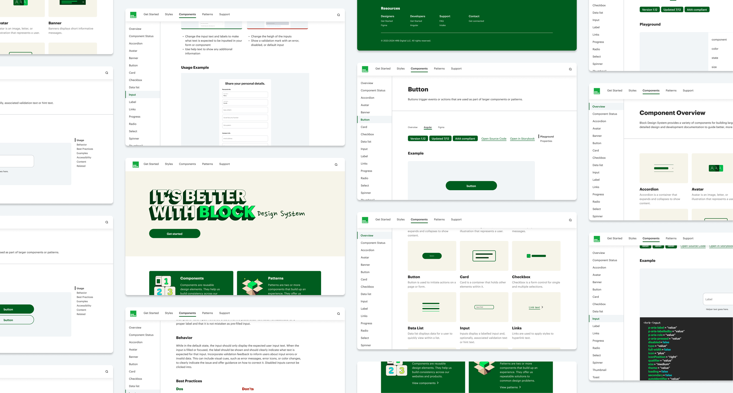
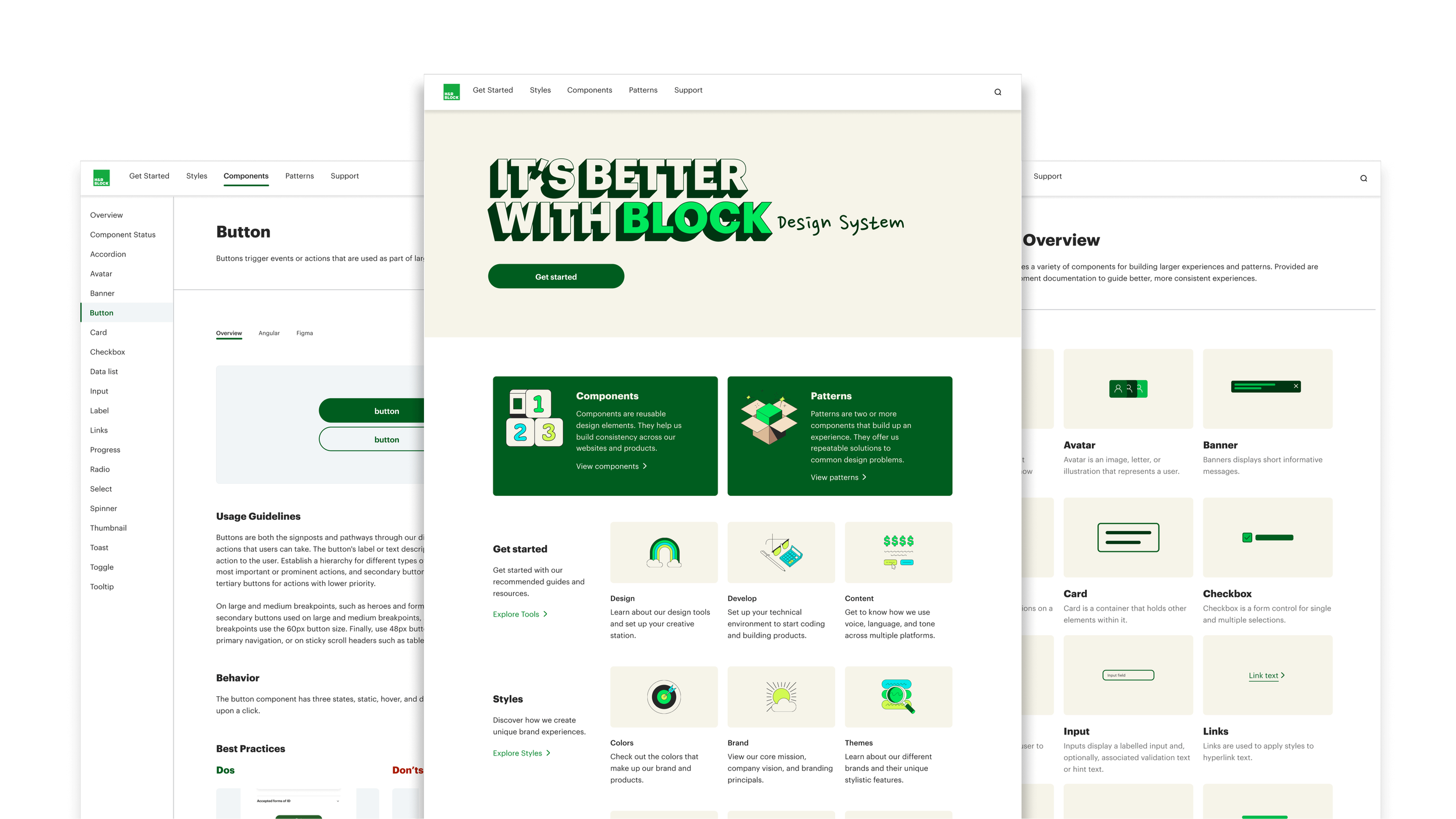
Find exactly what you’re looking for right from the home page! With a variety of jumping off points, users can navigate to all our main sections.
FINAL DESIGN
Component Overview
With over 20 components, our overview page makes finding exactly what you’re looking for convenient and easy!
FINAL DESIGN
Component Detail
Each component detail page provides clear usage guidelines, a live component demo, available properties, ready-to-use code snipets, design-specific specs and, figma properties
Next Steps
An iterative approach to improving
To strategically complete this project, our team has broken down the work into several phases. After our MVP documentation site launches, we will be focused on designing the next phase. In phase two of the documentation site, our team will be tackling the style pages, pattern pages, support pages, and get started pages.
Take Aways
Stay close to the system:
Our team wanted the new documentation site to be a pure expression of the Block Design System. We agreed that the site should not only give documentation and guidance but to also be a reference example of how to use the Block Design System to create products.
The hot potato approach:
The team took a “hot potato” approach otherwise known as UX dev. During the UX dev process, design and development happen in an iterative, back-and-forth manner. As the framework for designs were crafted, our developers began building out the basic structure. Designs would then be refined, fidelity would increase, and we would hand back off to development. This process allowed us to work hand in hand, identify blockers sooner, and collaboratively work towards a solution.


