E-Commerce Online Jewelry Store
About
Allure is an elegant but modern online fine jewelry store that crafts beautiful pieces for everyday use at a fair price. Allure works with expert jewelers who source high quality materials to guarantee the best products for our customers. Our online store lets users tailor to their needs using filters, beautiful photography and simple navigation.
Problem
Design a responsive e-commerce jewelry website to help users quickly find products that match their particular needs.
Role
UX Designer
UI Designer
Tools
Sketch
Invision
Success Metric
Increased Online Sales
D I S C O V E R Y
Competitive Analysis
Potential competitors that solve similar problems in the industry are: Linjer, Macy’s, and Mejuri. Combining market research and my competitors’ strengths and weaknesses, I evaluated how Allure could remain a competitive eCommerce solution. Overall, these are the top strengths and weakness of my competitors.
Conclusion
With eCommerce estimated to hit $5 trillion by the end of 2022 and a projected 16% increase in online sales, customers expect ease of use for their online shopping experience.
D I S C O V E R
User Persona
Rachel Baxter
About
Influencer
Jewelry & fashion fanatic
Extroverted
Friendly
Goals
Save time
Invest in quality jewelry
Shop on the go
Frustrations
Unorganized eCommerce website
Wasted time
Cheap jewelry
Bad customer service
UX Needs
Visually pleasing
Filters
Mobile friendly
D I S C O V E R
User Stories
After analyzing the market and understanding my users’ problems and goals, 3 user stories were defined:
I D E A T E
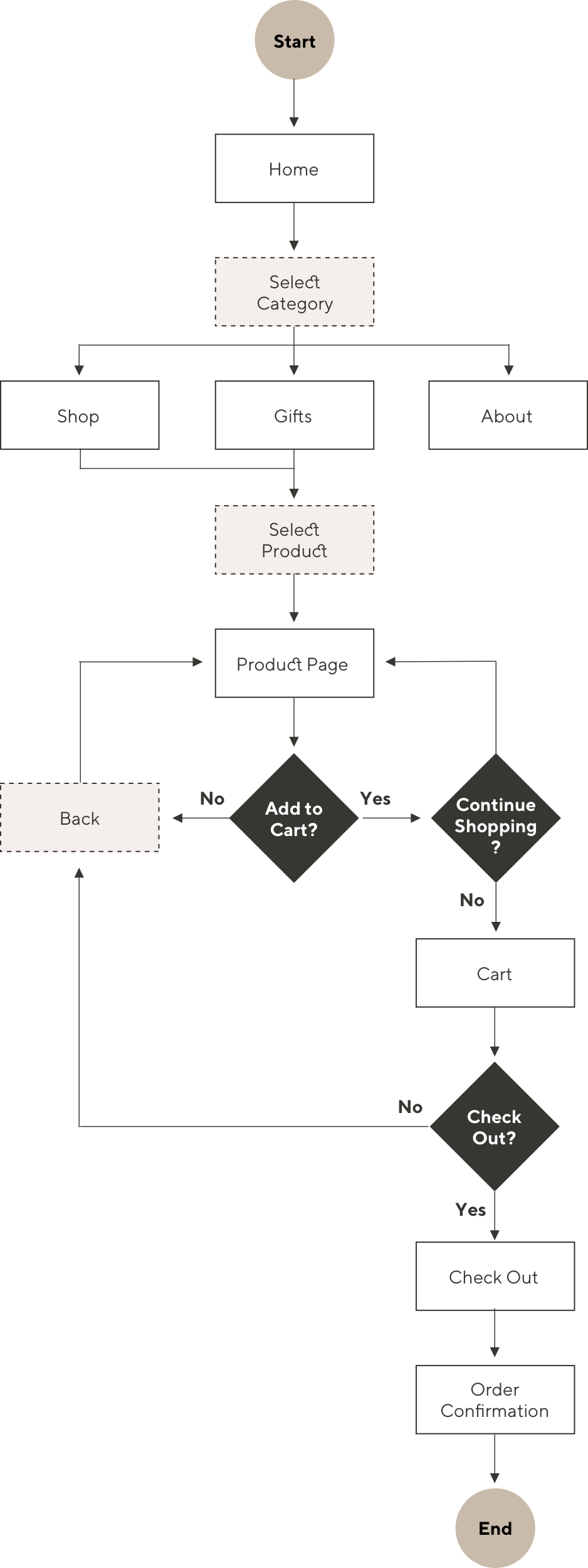
User Flow
Combining the three main user stories above, I created a user flow that let my users accomplish their goals in Allure’s site.
I D E A T E
Low-Fidelity Wireframes
Once my user flow was mapped, I began sketching ideas for my low-fidelity wireframes. After several iterations, the following screens were drafted as the basis of Allure. As most of my defined users will be purchasing products on their phones, I followed a mobile first design approach.
I D E A T E
Mid-Fidelity Wireframes
I then digitalized my sketches into mid-fidelity wireframes in Sketch.
I D E A T E
User Testing
Four perspective users were invited to test a mid-fidelity prototype of Allure’s eCommerce store. The prototype was built and tested in Invision. Users were asked to record their screens and narrate their actions and thoughts as they completed the following tasks:
1.) Add multiple items to your shopping cart
2.) Check out
Conclusion:
Adding an item to the cart needs to be visible and obvious to the user.
Solution:
1.) Notification that the item was added to the cart.
2.) Cart icon in the navigation will show the number of items in the cart.
D E S I G N
Visual Identity

Logo
The word “Allure” means to powerfully attract or charm. In this case: stunning jewelry. The logo evokes a feeling of power and beauty. It is both literal and symbolic, outlining the form of the letter “A” and mimicking a tear drop gemstone. “New York” is the typeface chosen for the logo, as it’s dramatic thin and thick strokes make it feel very elegant and charming.

Typography
Imagery & Iconography
F I N A L D E S I G N S
Browse Jewelry
Users can shop different jewelry products by jewelry type, trending items, new arrivals and much more!

Product Details
View a library of product photos, select a material, and check out verified customer ratings to ensure purchasing satisfaction.

Narrow Your Search
Get to what you’re looking for faster with filtered searching capabilities.
Easy Check Out
Add items to your cart, input your information and verify your order is on the way.

Responsive Design
Using 3 different breakpoints for small, medium, and large screens, I designed layouts that would respond accordingly to the device users were viewing Allure on.

P O S T P R O J E C T
Reflection
What went well?
My favorite part of this project was creating an elegant user interface that tied into the product photography. I also enjoyed creating an interface that helps users find exactly what they are looking for.
What were the challenges?
This project had a fast turn around time. Because of the time constraint I had to make sure I was extremely organized and had a solid starting direction. Once I laid a strong foundation, I was able to then build, test and implement the branding.
What would you do differently?
If I could do this over again, I would build out more screens and test with a broader audience. I tested using individuals from my target market, but would like to include some other testers that might be buying jewelry as a gift for my target audience. For example, I only tested women 20-30 years old, however I’d like to make sure the site is intuitive for other users like husbands or partners that may also use Allure.
Next Steps
This hypothetical eCommerce website was built with the goal to bring and retain as many users as possible. If this application was carried out in real life, I would gauge success on the net new traffic brought in, and user engagement. Based off of new data, analytical information, heat mapping, and user testing I would make design improvements accordingly.


